School website designs
Education Host Ltd builds websites for schools in the UK. These are the designs a school can choose from. Open any design to see a whole sample school in it, on a phone, tablet or computer.
The sample school, Hollybank Primary School, is fictional. Its name, people and contact details are invented, and the photographs are not of the school.
Sign-up is not open yet, so designs cannot be chosen at the moment. You can still look at all of them.
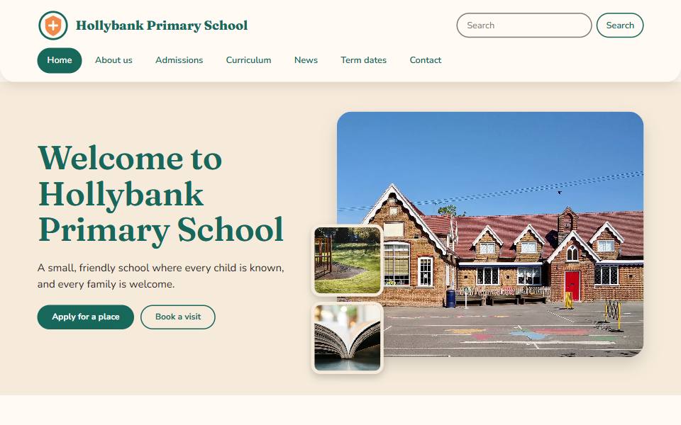
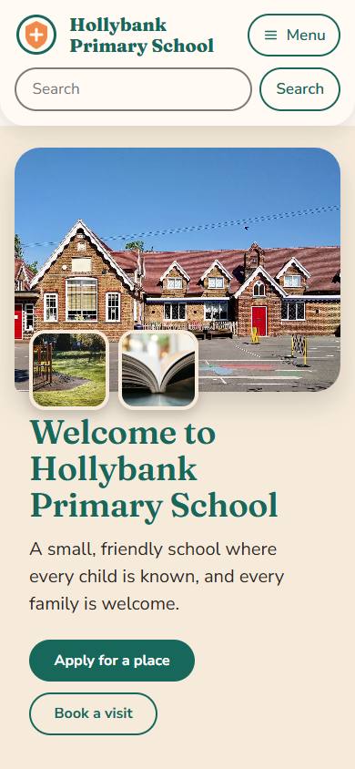
Warm and friendly
Community
Warm and friendly. Cream paper, deep teal and one bright orange accent, a soft serif for headings and a collage of photographs at the top of the home page.
Best for: Local primary schools that want to feel open, friendly and part of the neighbourhood.
- Primary schools
- Infant and junior schools
- Church schools
- Designed for phones first, and scales up to tablets and desktops
- Text and background colours meet WCAG 2.2 AA contrast
- You can change colours and fonts later, with two font choices and two header layouts to start from
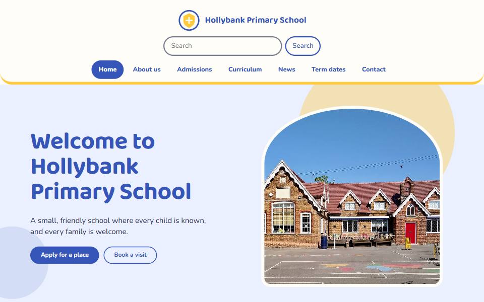
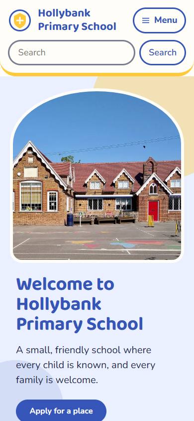
Warm and friendly
Little steps
Playful but calm. Rounded headings, soft shapes behind the photographs, a clear blue with a sunshine accent and arched picture frames.
Best for: Nurseries, pre-schools and infant schools that want a cheerful look without being childish.
- Nurseries and early years
- Infant and junior schools
- Primary schools
- Designed for phones first, and scales up to tablets and desktops
- Text and background colours meet WCAG 2.2 AA contrast
- You can change colours and fonts later, with two font choices and two header layouts to start from
Calm and traditional
Heritage
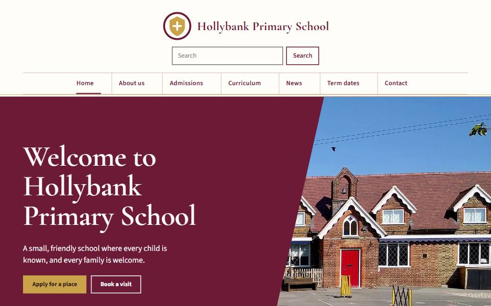
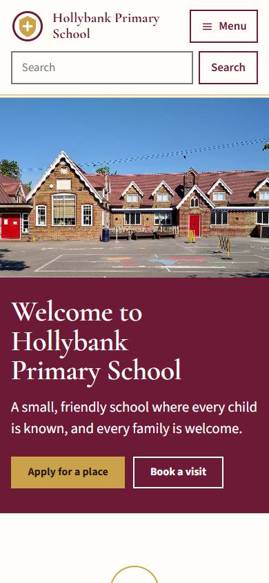
Elegant and established. Claret and old gold, a refined serif, the crest centred above the school name and a diagonal colour panel across the photograph.
Best for: Independent, preparatory and long-established schools that want a dignified first impression.
- Independent schools
- Church schools
- Primary schools
- Designed for phones first, and scales up to tablets and desktops
- Text and background colours meet WCAG 2.2 AA contrast
- You can change colours and fonts later, with two font choices and two header layouts to start from
Calm and traditional
Parish
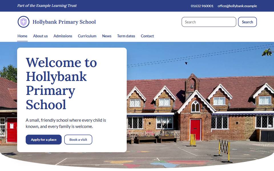
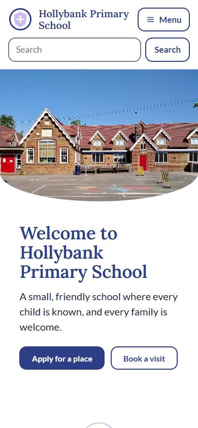
Calm and welcoming. Blues with a soft purple, a bar above the header for your school's verse or details, a curved photograph edge and a round portrait for the headteacher.
Best for: Church of England, Catholic and other faith schools, and any school with a gentle, caring tone.
- Church schools
- Primary schools
- Infant and junior schools
- Designed for phones first, and scales up to tablets and desktops
- Text and background colours meet WCAG 2.2 AA contrast
- You can change colours and fonts later, with two font choices and two header layouts to start from
Calm and traditional
Abbey
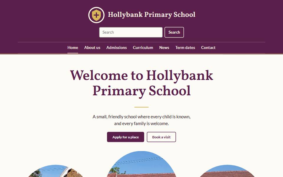
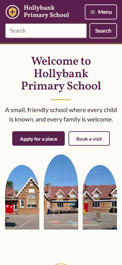
Quiet and reverent. Deep plum with gold, a bookish serif, a centred header, and the main photograph shown through three arched window shapes below the welcome.
Best for: Catholic and other faith schools that want a calm, dignified site with a sense of occasion.
- Church schools
- Primary schools
- Independent schools
- Designed for phones first, and scales up to tablets and desktops
- Text and background colours meet WCAG 2.2 AA contrast
- You can change colours and fonts later, with two font choices and two header layouts to start from
Nature and outdoors
Village
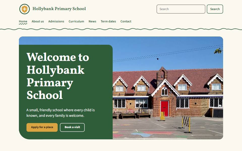
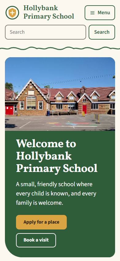
Intimate and rooted. An old-style serif, earthy green and ochre on parchment, a photograph set into the page and one hand-drawn line used sparingly.
Best for: Small rural and village schools with a close community and a love of the outdoors.
- Primary schools
- Church schools
- Infant and junior schools
- Designed for phones first, and scales up to tablets and desktops
- Text and background colours meet WCAG 2.2 AA contrast
- You can change colours and fonts later, with two font choices and two header layouts to start from
Nature and outdoors
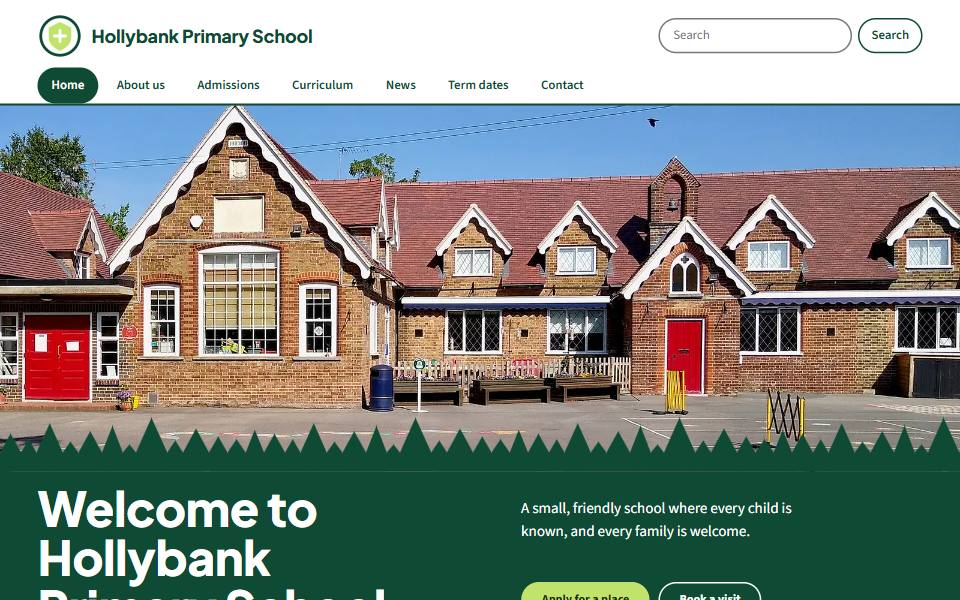
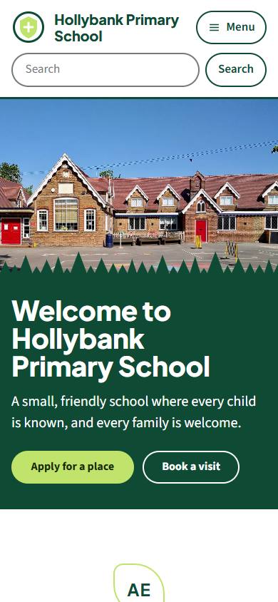
Forest
Fresh and outdoorsy with a modern feel. Deep pine green and one spring green accent, a bold sans, and a line of treetops cut across the main photograph and the footer.
Best for: Forest schools and schools that make a lot of outdoor learning, gardens and grounds.
- Primary schools
- Nurseries and early years
- Infant and junior schools
- Designed for phones first, and scales up to tablets and desktops
- Text and background colours meet WCAG 2.2 AA contrast
- You can change colours and fonts later, with two font choices and two header layouts to start from
Bright and modern
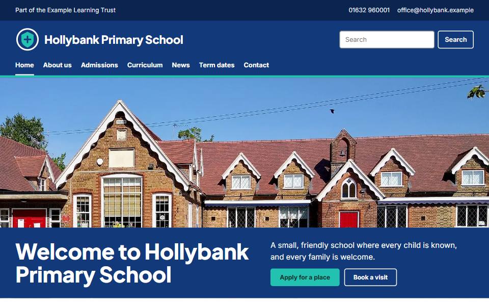
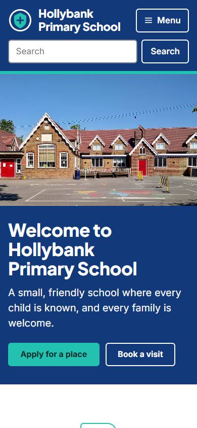
Academy
Modern and confident. Navy with an aqua accent, a geometric sans, a full-width photograph with a solid band of colour, crisp grids and room for a trust bar.
Best for: Academy trusts, secondary schools and any school that wants a clean, contemporary look.
- Secondary schools
- Primary schools
- Other schools
- Designed for phones first, and scales up to tablets and desktops
- Text and background colours meet WCAG 2.2 AA contrast
- You can change colours and fonts later, with two font choices and two header layouts to start from
Bright and modern
Headline
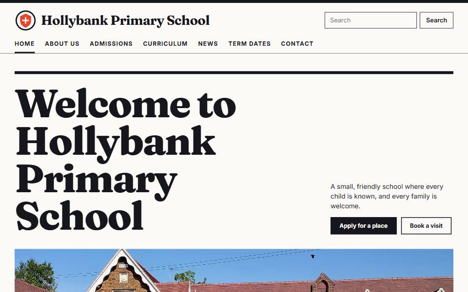
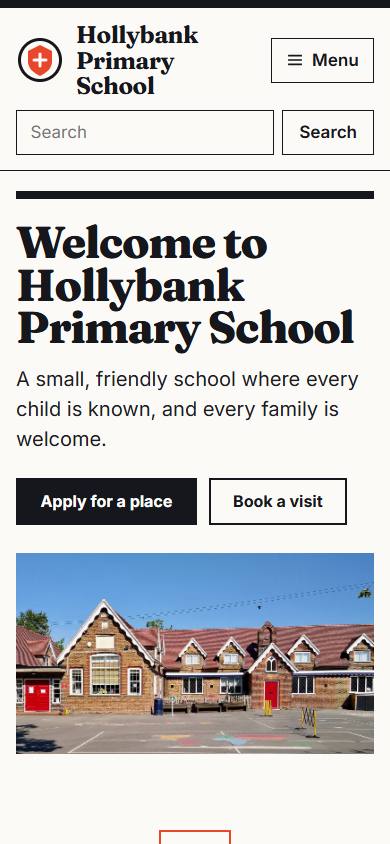
Confident and editorial, like a well-made newspaper. A very large serif headline above a wide photograph, ink black on warm white with one red accent, and tidy ruled lists for news and dates.
Best for: Secondary schools and sixth forms with plenty of news, dates and results to share.
- Secondary schools
- Independent schools
- Other schools
- Designed for phones first, and scales up to tablets and desktops
- Text and background colours meet WCAG 2.2 AA contrast
- You can change colours and fonts later, with two font choices and two header layouts to start from
Bright and modern
Panorama
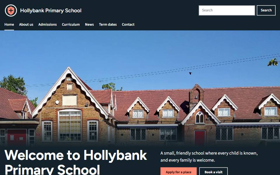
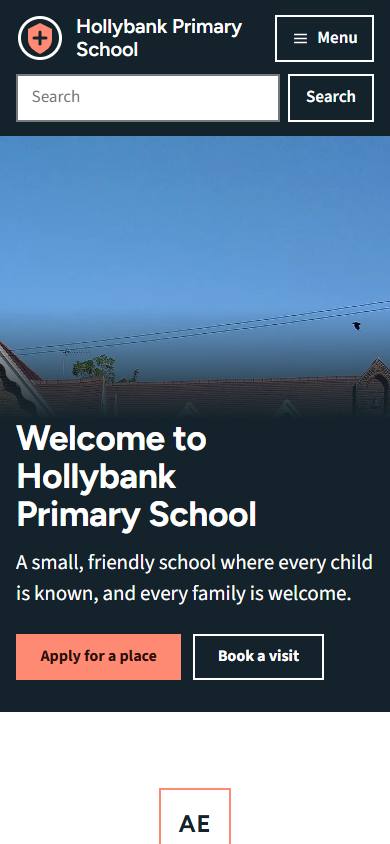
Led by your photographs. One picture fills the top of the home page with the words set over its lower edge on deep charcoal, and tall photo tiles carry their titles the same way.
Best for: Schools with strong photography of their buildings, grounds and school life.
- Independent schools
- Secondary schools
- Primary schools
- Designed for phones first, and scales up to tablets and desktops
- Text and background colours meet WCAG 2.2 AA contrast
- You can change colours and fonts later, with two font choices and two header layouts to start from
Bright and modern
Civic
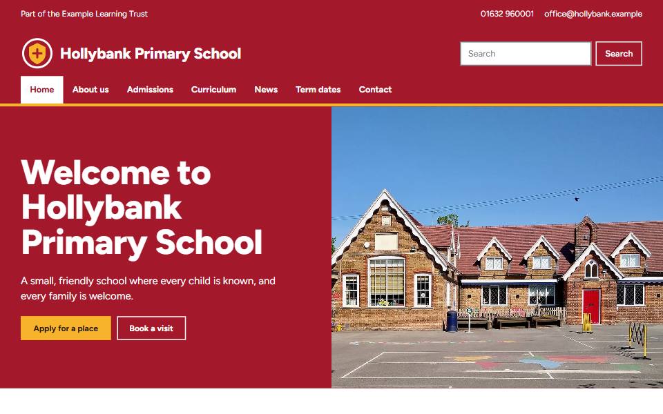
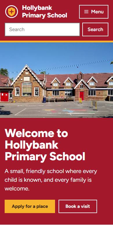
Strong and busy-friendly. Crimson and amber colour blocking, a confident sans, a split photograph and colour hero, and room for lots of news and dates.
Best for: Large urban primary and junior schools with a lot to say and a lot of families to reach.
- Primary schools
- Infant and junior schools
- Secondary schools
- Designed for phones first, and scales up to tablets and desktops
- Text and background colours meet WCAG 2.2 AA contrast
- You can change colours and fonts later, with two font choices and two header layouts to start from
Bright and modern
Poster
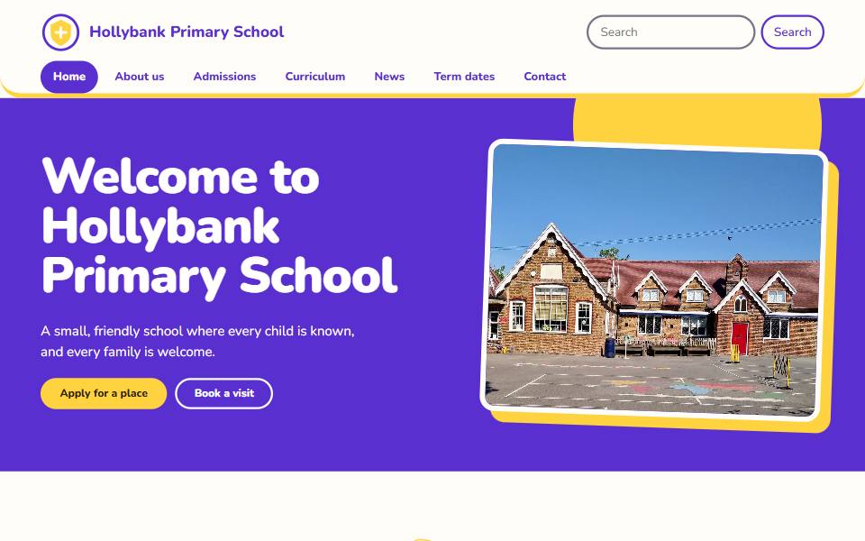
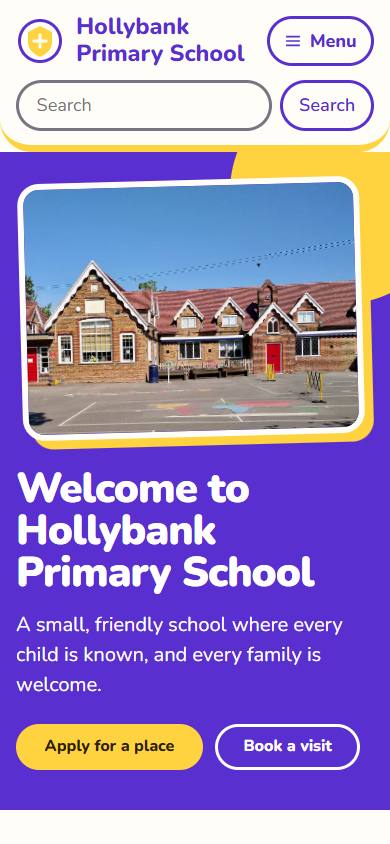
Bright and lively. Big blocks of violet with one sunny yellow accent, chunky rounded headings, and photographs and cards that look like stickers with thick edges.
Best for: Junior and primary schools that want an energetic, colourful site that still reads clearly.
- Infant and junior schools
- Primary schools
- Designed for phones first, and scales up to tablets and desktops
- Text and background colours meet WCAG 2.2 AA contrast
- You can change colours and fonts later, with two font choices and two header layouts to start from
Clear and simple
Clear
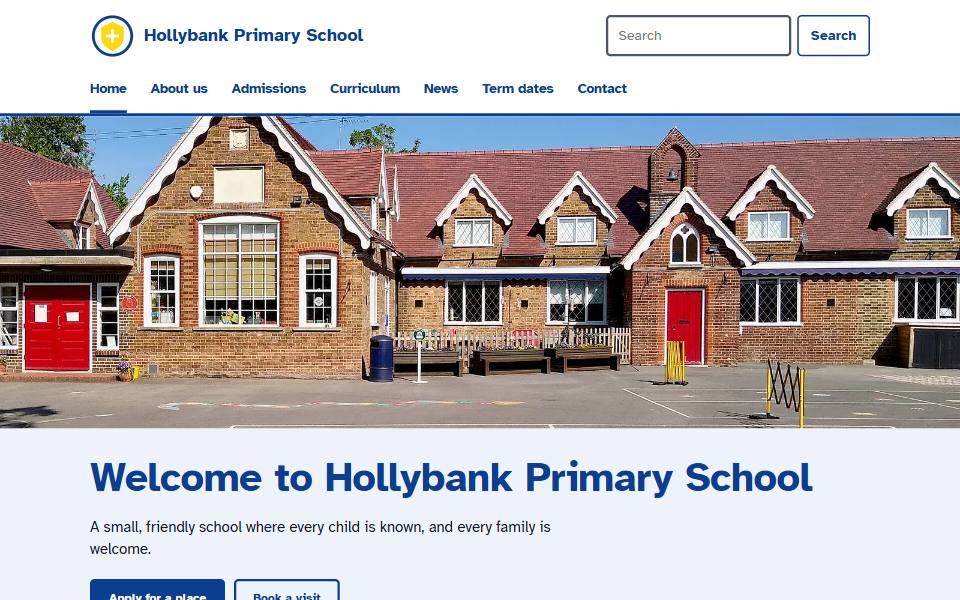
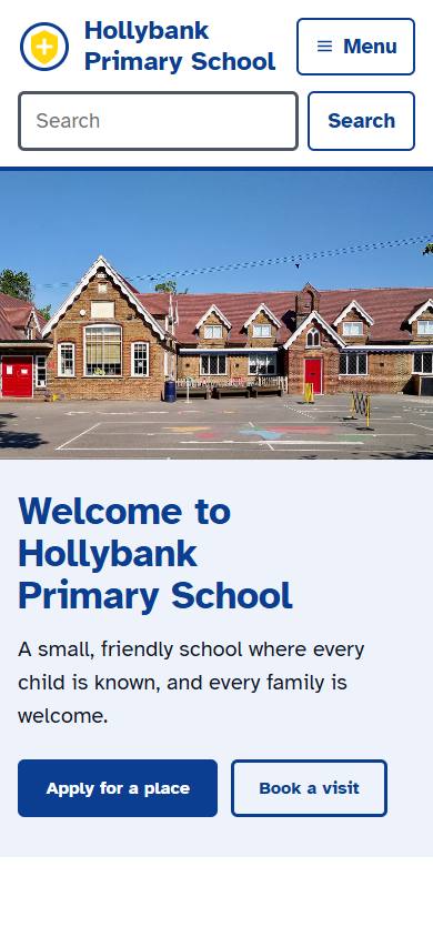
Plain and easy to read. Atkinson Hyperlegible type designed for low vision, high contrast, larger text, thick underlines and no ornament.
Best for: Any school, and especially schools with many families who benefit from large, clear text.
- Special schools
- Primary schools
- Secondary schools
- Other schools
- Designed for phones first, and scales up to tablets and desktops
- Text and background colours meet WCAG 2.2 AA contrast
- You can change colours and fonts later, with two font choices and two header layouts to start from
Clear and simple
Haven
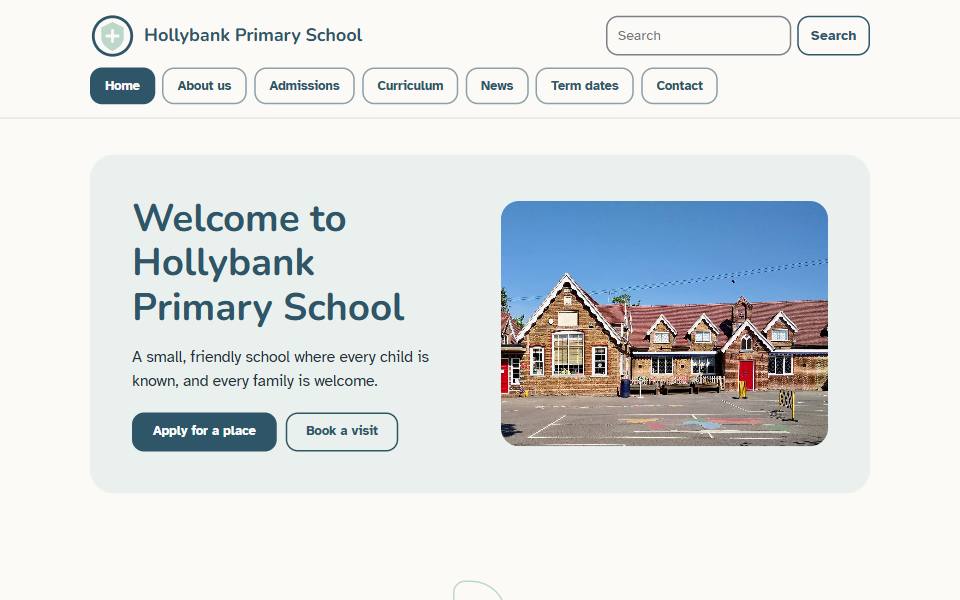
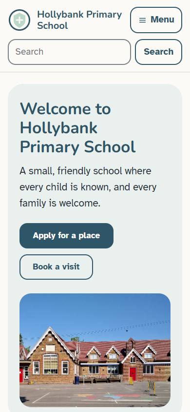
Calm and unhurried. Soft blue grey and sage on warm white, large type with generous spacing, a menu of big separate boxes, and no shapes or movement to distract.
Best for: Special schools, and any school whose pupils and families benefit from a quiet, low stimulation page.
- Special schools
- Primary schools
- Other schools
- Designed for phones first, and scales up to tablets and desktops
- Text and background colours meet WCAG 2.2 AA contrast
- You can change colours and fonts later, with two font choices and two header layouts to start from
No designs match both choices. Choose “All styles” or “All schools” to see more.